In the first week of Malta’s 2026 election campaign, the country’s roadsides told two very different political stories. On one side stood a singular, almost austere presence; on the other, a chorus of shifting messages that seemed to speak in many tones at once.
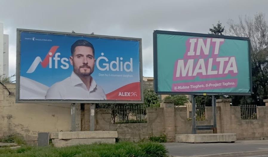
The Nationalist Party chose simplicity – perhaps even rigidity. Across the islands, its billboard was one and the same: opposition leader Alex Borg, staring out with a stern, composed expression against a light blue backdrop. The message was contained in two words – Nifs Ġdid – a “fresh start”. It was a clear attempt to reintroduce the party through its new leader, to frame the election as a moment of renewal.
But the execution raised questions. The stylised “N” in Nifs – formed by a ribbon in the white and red of the Maltese flag – was not immediately legible. For many passers-by, the first impression was incomplete, even confusing. “Ifs,” some wondered, before realising the intended word. It was a small design choice, but one that hinted at a broader issue: a message that required a second look in a medium built for instant clarity.
Still, the PN’s approach carried a certain discipline. It was controlled, consistent, and leader-focused. There was no distraction from the central figure. Borg’s face, his expression, and the promise of change were meant to do all the work. Whether that restraint would translate into impact remained an open question.
In contrast, the Labour Party adopted a markedly different strategy – one that avoided a single focal point altogether. Its leader was notably absent from the billboards. Instead, Labour’s campaign unfolded as a patchwork of messages, colours, and faces, many of them belonging to ordinary people rather than politicians.
Some billboards featured only words, short and direct. Others paired slogans with images of individuals who appeared to represent everyday life, coupled with some of the measures Labour is proposing. The variety was striking, as was the deliberate choice of colour. Gone was the traditional dominance of red. In its place came pale greens, blues, yellows, and pinks – tones that softened the party’s visual identity and broadened its appeal.
It was a calculated move. By stepping away from its established colour scheme and avoiding overtly partisan imagery, Labour seemed to be positioning itself beyond its core base. The campaign suggested inclusivity, or at least the intention to appear less politically defined. It also conveyed preparation: the breadth of messages implied that this was a campaign planned well in advance, with multiple narratives ready to be deployed.
The imbalance in visibility was also hard to ignore. Labour’s billboards were more numerous, more varied, and more strategically placed. The PN’s single design, repeated across locations, struggled to compete with that saturation.
Yet this disparity did not go uncontested. Borg accused Labour of blurring the line between party and state, alleging that government-funded billboards – paid for by taxpayers – were being used to carry partisan messages. It was a serious charge, one that introduced a different kind of contrast between the campaigns: not just in style, but in the resources and structures behind them.
As the campaign moves forward, these early billboard choices may evolve. The PN could diversify its messaging; Labour might yet bring its leader into view. But in this opening week, the difference was stark. One party asked voters to focus on a single face and a single promise. The other offered a multitude of voices, carefully arranged to suggest a broader, more inclusive narrative.
Whether voters respond more to clarity or variety remains to be seen. For now, Malta’s billboards reflect not just competing messages, but competing philosophies of how those messages should be seen.