At the FIFA World Cup, which started on June 11, not only national teams compete. Sportswear brands also compete on it – in ingenuity and aesthetics. “Kommersant” studied more than a hundred uniforms made by different manufacturers for different teams, and selected 11 of the most stylish kits and 11 of those that you want to quickly forget. Let’s start with the anti-rating.
Worst forms
11. Portugal (away)
The idea is clear: Portugal is a maritime power… But for some reason, seeing a puma drowning in the ocean makes you feel bad. Why did you need to highlight the bottom of the T-shirt?! Cristiano Ronaldo will have to spend the last World Cup of his career in a bib.
10. Netherlands (home)
It seems Nike fatally missed the mark with the shade. There is nothing noble about this neon orange. It looks like the Dutch jersey was colored with a marker.
9. Paraguay (home)
And here there are more options. Perhaps the Paraguayans’ T-shirt was painted with red wax crayon. Or maybe they just spilled some white powder on her…
8. New Zealand (away)
Experiments with monotonous black shapes rarely end well. The New Zealand T-shirt, decorated with silver fern “leaves,” shimmers like a puddle of motor oil on the asphalt.
7. Croatia (home)
This, of course, is a matter of taste, but… The cells seem too small (on the previous uniform presented by Nike in 2024, they were simply gigantic). And finally everything is spoiled by this white stripe in the middle, on which everything in the world is piled: two emblems, match details and player number.
6. Qatar (away)
Find an Adidas brand store (in Russia this is no longer so easy to do), buy a regular white T-shirt, take it to a decent printing house and send the manager a PNG file of the Qatar Football Association emblem. Ready.
5. Uruguay (away)
A very strange set. They write that the pattern is inspired by the costume of the Black Panther, a superhero from the Marvel universe. Questionable Uruguayanness. And again – like the Croatians – this “console” is in the middle. Also, blue numbers don’t go well with iridescent logos.
4. Czech Republic (travel)
Puma says the design references Bohemian crystal. It seems like a hint: this form should be treated like crystal glassware collecting dust in Soviet sideboards – taken out less often.
3. Uzbekistan (any)
The Uzbekistan national team was dressed by the local brand 7Saber. The home and away kits differ only in color. And the pattern, which apparently should resemble national embroidery, evokes other associations. This is roughly what the pictures with optical illusions that circulated on the RuNet looked like ten years ago.
2. Haiti (any)
At least something is stable: the Haitian national team for the second time in a year – as at the Olympics in Milan and Cortina d’Ampezzo – had to change its uniform due to the fact that the regulator saw a “political statement” in its design. The independence fighter Toussaint Louverture was removed from the Olympic set, and the red horse was left without a rider. The image of the Battle of Vertieres was erased from the T-shirt prepared for the World Cup. The only difference is that the uniform for the Games delighted many, but this one could only impress the leavened (or creamy – is that the national Haitian drink?) patriots. Before FIFA intervened, it looked like this.
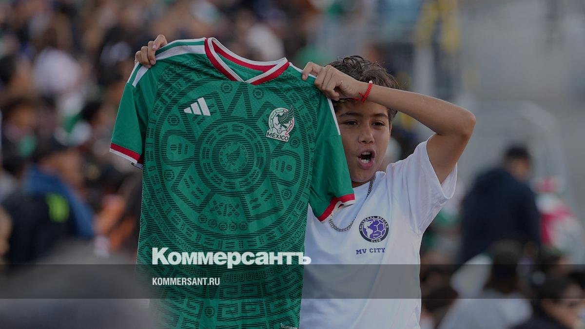
1. Iran (any)
“Golden Raspberry”! Iranian T-shirts from the local brand Majid differ from each other only in color. What distinguishes them from decent T-shirts is the creepy photograph of an Asian cheetah on the stomach. By the way, the intentions were good: they were trying to attract attention to save an endangered species.
The best forms
11. France (home)
Recognizable. Stylish. Especially in combination with white shorts and red socks, as in the photo (sometimes the French wear an all-blue set). Could have been ranked higher if not for the flimsy collar and strange font.
10. Panama (travel)
A nice retro look from Reebok, which hasn’t made football kits for anyone in what seems like a very long time. Nostalgic fans will probably remember Jay Jay Okocha, who wore a similar jersey for Bolton in the early 2000s.
9. Spain (home)
Many of the latest Adidas kits have the same problem: those incredibly thick stripes on the sleeves hurt the eyes. But the Spanish form, even despite this, was a success. The result is a kind of hybrid of home and away kits from the victorious 2010 World Cup. We also note the original font: the columns of the Royal Palace in Madrid seem to be inscribed in the numbers.
8. Germany (home)
The collaboration between the German national team and Adidas lasted more than seven decades. It will end with perhaps the most successful of many attempts to rework the design of the now iconic T-shirt from the triumphant 1990 World Cup. And then the German national team will be dressed by Nike.
7. Scotland (away)
Adidas again. Again a game with references to old samples. True, there is, of course, no cult status in the form of the 1993 Scottish team. However, it’s still beautiful. Extremely nice color palette and cute thistle on the inside of the collar.
6. Ghana (home)
Puma never gave up trying to connect football uniforms with various elements of national culture. The Ghanaian version, prepared under the creative direction of local artist Prince Gyasi, was a success. The pattern refers to the Ananse spider, a character from West African folklore. The designers also said something about the traditional Ghanaian textile kente, but it’s not easy to recognize it in this form.
5. Curacao (away)
The team from the tiny island of Curacao will debut at the World Cup wearing one of the most beautiful jerseys. Everything about it is good: the lemon shade and the details. One could, however, argue that it looks more like a streetwear shirt than a football jersey, but it doesn’t seem to matter.
4. Morocco (home)
An ordinary shape has been transformed into a very special detail: an emblem in the middle, traditional Moroccan embroidery motifs on the collar and sleeve trim. Gracefully.
3. Japan (travel)
The New York Yankees always win because their opponents can’t stop staring at the pinstripes on their uniforms, seasoned hustler Frank Abagnale explained to his son in the movie Catch Me If You Can. Well, the Japanese opponents may face the same fate. This jersey is very reminiscent of old baseball jerseys, including those worn by the Yankees in the 1980s. And the stripes on it are also very cute.
2. Norway (home)
It’s hard to imagine anyone being surprised by a T-shirt that essentially just has the national flag on it. But Nike got it right: it made a uniform from the category of those that become instant classics. An interesting detail is the pattern on the blue cross. It repeats the ornament on the carved panels of the wooden church in Urnes of the 12th century – the oldest surviving church.
1. France (away)
The French national team brought a mint green away kit to the United States, inspired, of course, by the Statue of Liberty, gifted to the Americans by the French in 1886. The shade goes well with both tricolors and “copper” emblems.